10 Inspiring UX Portfolios and Why They Work
No matter what type of design you do, an online portfolio is a must. In most cases, companies and clients simply won’t consider you for a job without one. While a UX designer may believe their work doesn’t translate well to a visual platform, a portfolio is even more important for UX work.
This is where you can walk people through your process and share details you can’t fully explain in a resume or even in a conversation. A portfolio will help potential employers or clients better understand how you think and what sets you apart — at least if you do it right.
Through my work with Semplice, my portfolio system for designers, I’ve seen many examples that show even complex UX work translate beautifully in a design portfolio. Check these portfolios from some talented UX designers (all portfolios built with Semplice) to learn how to share your work in a visual and memorable way.
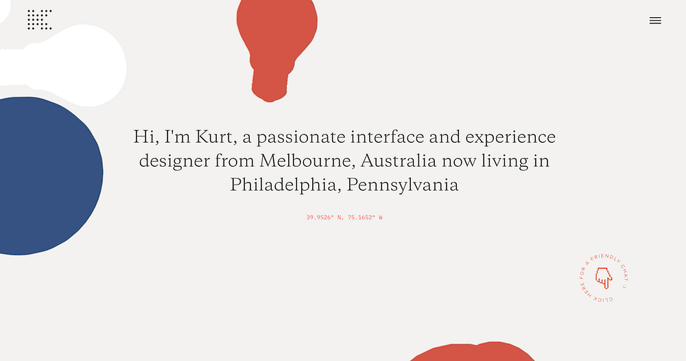
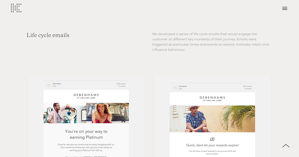
1. Kurt Winter

What I most enjoy about Kurt’s UX portfolio: It doesn’t feel like a UX portfolio. Unfortunately, it’s too easy for UX portfolios to be overloaded with device renderings, prototypes and huge blocks of research text. Kurt still shares all the necessary details, but succeeds in making it visually engaging. Take note of his layout, icons and scannable text, all of which amount to a portfolio worth reading.

2. Liz Wells

Liz Wells is our poster child for UX portfolio design. Not only is her portfolio great to look at, but she makes it easy to understand what she does and how her work fits into a successful final product. Each case study tells a story with a similar structure:
- Brief summary at the top
- The task at hand
- UX challenges
- UX solutions
This makes it easy to understand her approach from the beginning all the way through to solution. And most impressively, she includes tons of images to illustrate her process: early sketches, scribbled notes, wireframes. Many of these visuals are simply ripped from a notebook or jotted quickly on a whiteboard — visuals any UX designer has at hand at any given moment. But Liz goes above and beyond, photographing these notes just like you would a print project, with complementary backdrops and lovely little props. She follows through with images and videos of the final product, making the project come to life on the screen.

You may think you don’t have much to show of your process, especially the strategy and research phases, but even quick notes jotted down in a brainstorm can be valuable for your portfolio. Save these little pieces throughout your project and you’ll be surprised how easily the story comes together later.
3. Isa Pinheiro

In contrast to Liz’s behind-the-scenes case studies, Isa Pinheiro shares polished finished products in her portfolio and explains how her work affects the end user.
Take her project for Japan’s Railway System. Isa embeds interactive prototypes into the page, so readers can experience the final product for themselves straight from her portfolio. This is a great solution if you don’t have the little bits and pieces to share from early project phases.

Isa also takes the time to add little personal touches throughout her portfolio. Check out her two unique navigation options: One is a full-screen takeover with two straightforward menu items, and the other is a visual navigation with an image for each item. Smooth scrolling and full-screen cover sliders add a visual punch to her portfolio beyond her project pages.
4. Oykun Yilmaz

Oykun Yilmaz keeps his project summaries short and sweet, with a sentence introducing the client and a quick overview of the project goals. But he makes sure to include specific results with hard numbers, a great addition that many portfolio case studies sadly lack. UX work can seem abstract to people, so make it concrete by explaining how your work made a tangible impact.
5. Naim Sheriff

With a subject that could easily seem complicated to an outside viewer, Naim Sheriff strips it all down and makes it real for readers. Take his Ideapaint case study for example, where he shares how important the Design Exploration phase is and how he typically goes about it. He even poses the questions he asked himself during the project, like: “How do we successfully show the differences between similar products? How does the customer know how much paint to buy for their space?” Then he shares the solution he came to with his team. (Read more tips for writing great portfolio case studies here.)

This makes UX design work approachable for clients who might know they need a UX designer, but not understand all the insider terms and inner workings of the job. Aim to make it easy for anyone, even a recruiter (who might know nothing about design), understand what you do.
6. Sebastián Martínez

Sebastián Martínez takes you straight into his work with a single-page portfolio. His case studies are short, but he does one thing many designers forget to do: He shares how he feels about the final product. “It was one of the most complete, entertaining products which I was proud to work on,” Sebastián says of his Monkop Test Cloud project. It doesn’t take much, but sharing how you feel about your work makes a difference.
For our “How to Get a Job at X,” series, I interview designers and recruiters from top companies, simply asking how we might get a dream job on their design team. Many of them have said that they want to know what you think about your project and the results. It brings depth to your work and gives us a window into your mind.
7. Husam Elfaki

Husam Elfaki’s portfolio case studies lead with a full paragraph introducing the project, goals and results. But instead of leaving it at that and dumping a bunch of photos beneath, he breaks it down and explains each piece of the project along the way.
Don’t just put images on a page and hope your viewer can decipher what they mean — take the time to write captions or short summaries that explain your projects from beginning to end.
8. Kali and Karina

Kali and Karina do everything, from concept to finished product. They rarely mention UX/UI, but it’s implicit in their case studies. From nicely designed user journeys, black and white sketches to full-color results, they share their projects like a story. It helps that their work is awesome on its own, too.
VIEW KALI & KARINA’S PORTFOLIO
9. Elliot Owen

Elliot Owen calls attention to specific gestures, interactions and experiences that make his projects successful. Take his British Airways case study, for example.

He shows how small functions or features make a big difference for the project. And he uses GIFs in all the right places, not to dazzle or distract the viewer but to show exactly how his UX projects work.
10. Veda Dsiljak

Veda Dsiljak’s case studies almost feel like product marketing pages, they sell the work so well. Instead of simply naming his pages with the title of the product or project, he writes headlines with personality. This sets his work up nicely and creates intrigue right from the start. He ends each case study with a link to download the actual product, so readers can experience it for themselves.
11. Jason Yuan

While some examples we’ve shared allow you to interact with the project on the page, Jason Yuan uses videos with mouse movement to let you visualize the experience. In this way he guides the reader through his work in the way it’s intended to be used.
Side note for young designers: Jason’s work for Apple is an unsolicited redesign but it’s so detailed and well-thought out, it feels like real client work. Unsolicited redesigns are a great way to show your skill and interests early on in your career, or if you’re looking to get into a new design path. I always recommend against doing unsolicited designs for big companies like Apple, since they already have an established established brand which makes it too easy. But in this case, Jason’s hard work paid off with features in FastCoDesign, Next Web, Mic and more.
–
Just like in your everyday work, you’ll need to be thoughtful and strategic when creating a UX design portfolio. Take time to explain your process, walk your reader through each step of your work and show how it makes an impact, and you’ll make a portfolio worth remembering. P.S. If you’re looking for more portfolio inspiration, check out the Semplice Showcase.
